
Color matching theory, also known as color theory, is a field of study that deals with the principles and guidelines for creating harmonious and visually pleasing color combinations. It is an essential aspect of various fields, including art, design, fashion, and even psychology. Color matching theory explores how different colors interact with each other and how they can be combined to achieve specific aesthetic or communicative goals. Here are some fundamental concepts within color matching theory:
Color Wheel: The color wheel is a circular diagram that represents the relationships between colors. It typically includes primary colors (red, blue, and yellow), secondary colors (green, orange, and purple), and intermediate or tertiary colors created by mixing primary and secondary colors.
Primary Colors: Primary colors are hues that cannot be created by mixing other colors. They are the building blocks for all other colors. In traditional color theory, red, blue, and yellow are considered primary colors.
Secondary Colors: Secondary colors result from mixing two primary colors. They are green (from blue and yellow), orange (from red and yellow), and purple (from red and blue).
Tertiary Colors: Tertiary colors are created by mixing a primary color with an adjacent secondary color on the color wheel. For example, mixing red (primary) with orange (secondary) produces a tertiary color.
Color Harmony: Color harmony refers to pleasing combinations of colors. Various color schemes, such as complementary, analogous, triadic, and split-complementary, help create harmonious color palettes. These schemes are based on the relationships between colors on the color wheel.
- Complementary Colors: Complementary colors are located opposite each other on the color wheel, such as red and green or blue and orange. They create a strong contrast when used together.
- Analogous Colors: Analogous colors are located next to each other on the color wheel and share similar color properties. Using these colors in a design creates a sense of unity and cohesiveness.
- Triadic Colors: Triadic colors are evenly spaced around the color wheel, creating a balanced and harmonious color palette.
- Split-Complementary Colors: This scheme involves one base color and two colors adjacent to its complementary color. It offers a pleasing contrast with a bit more subtlety than pure complementary colors.
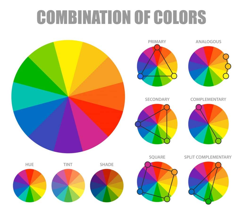
Image by macrovector on Freepik
Color Temperature: Colors can be categorized as warm or cool. Warm colors (e.g., red, orange, yellow) are associated with energy and warmth, while cool colors (e.g., blue, green, purple) convey calmness and serenity.
Color Psychology: Different colors can evoke specific emotions and reactions in people. Understanding color psychology can be crucial in design and marketing. For example, red is often associated with passion and urgency, while blue is linked to trust and calmness.
Color Mixing: Understanding how to mix colors, whether through pigments in art or RGB values in digital design, is vital in color theory. The subtractive color model (used in art, printing, and painting) involves mixing pigments, while the additive color model (used in digital displays) combines light colors like red, green, and blue.
Color matching theory is a versatile and complex field, and its application can vary depending on the context, medium, and the intended message or effect. It plays a significant role in visual arts, graphic design, interior design, fashion, and marketing, among other areas.